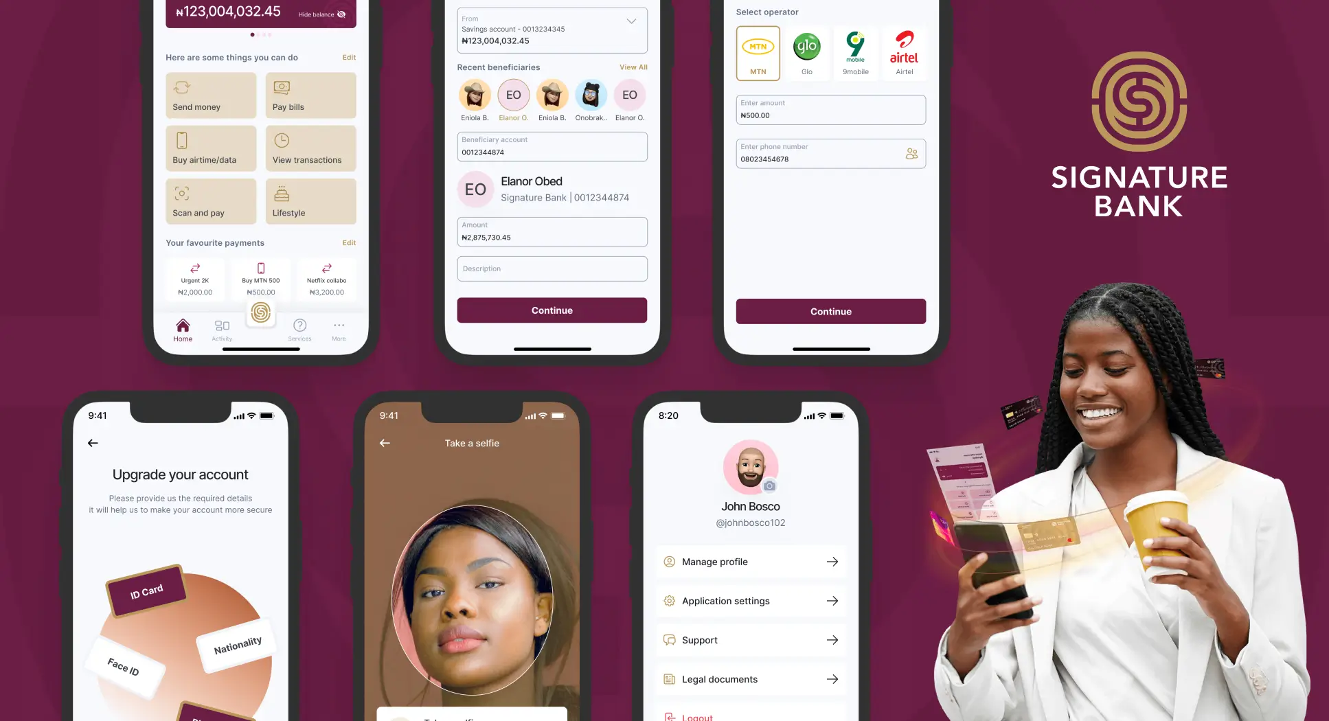
Signature Bank
-
Client
Elara Solutions
-
Role
UI/UX Designer
-
Duration Date
4 months
-
Tools
Analysis, Wireframing, Figma
- Status
The Problem
Banking for the unbanked
Signature Bank Nigeria, launched in November 2022 by Alex Otti, aims to serve over 40 million unbanked Nigerians. The bank focuses on addressing customer service and digital banking gaps left by existing banks. As a client of Elara Solutions, Signature Bank needed a mobile application to meet its digital banking needs. There have been challenges attracting new users in northern Nigeria, and this mobile app is designed to facilitate new user onboarding and streamline transactions, eliminating the hassle of long bank queues.
What I did
Competitive Analysis, App Architecture, Component Design, High Fidelity Mock Up and more...
As a UX Consultant with Elara Solutions, I worked closely with the Project Manager to gain a thorough understanding of Signature Bank’s needs and their execution strategy. The Project Manager provided a software requirements document outlining all potential app features. Leveraging my experience in the financial sector, I swiftly suggested the app architecture and further segmented the requirements document into product-specific features. Here is an overview of my design process:
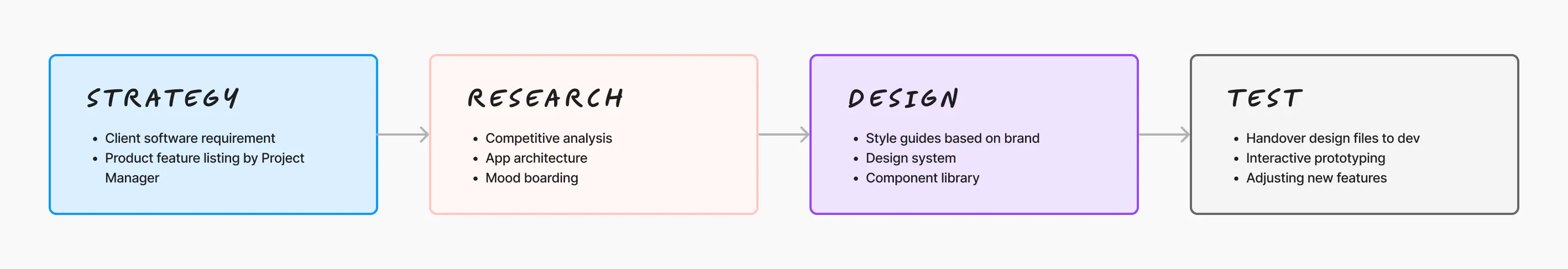
Competitive Analysis
To understand the current market landscape and improve user experience, I conducted a competitive analysis of the top four banks in Nigeria: Guaranty Trust Bank (GTBank), Zenith Bank, First Bank of Nigeria, and Access Bank. These banks not only have a strong presence in Nigeria but also cater to customers across Africa. Here's a detailed comparison of their mobile apps based on various UX criteria:
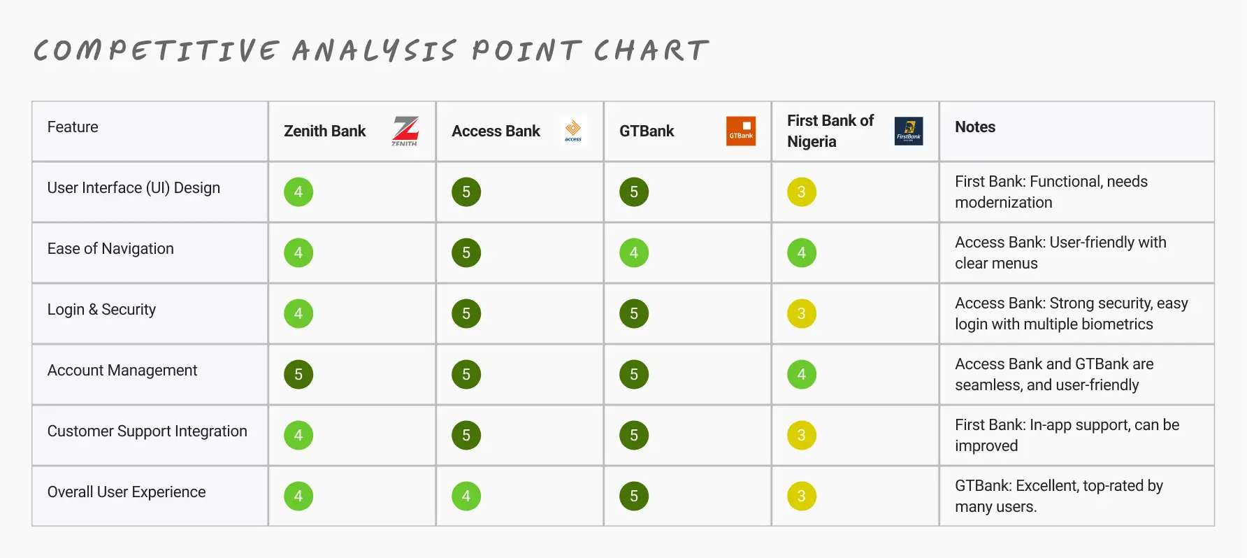
Competitive Analysis Summary:
- Zenith Bank: Known for its clean, modern design, Zenith Bank's app is user-friendly, reliable, and secure. The app provides a highly satisfactory user experience with regular updates and quick bug fixes.
- Access Bank: With an intuitive and visually appealing interface, Access Bank's app offers seamless account management and strong security. Frequent updates ensure a smooth and user-friendly experience.
- GTBank: GTBank's app excels in sleek, minimalist design and intuitive navigation. It is highly rated for its fast performance and excellent security options, providing an exceptional user experience.
- First Bank of Nigeria: While functional, First Bank's app would benefit from modernization and improved navigation. It offers comprehensive features but has mixed user reviews, indicating room for enhancement.
This competitive analysis highlights the strengths and areas for improvement in each bank's mobile app, providing valuable insights for optimizing user experience. This further made me see what best to take into consideration also.
Translating Software Requirement into Product Features
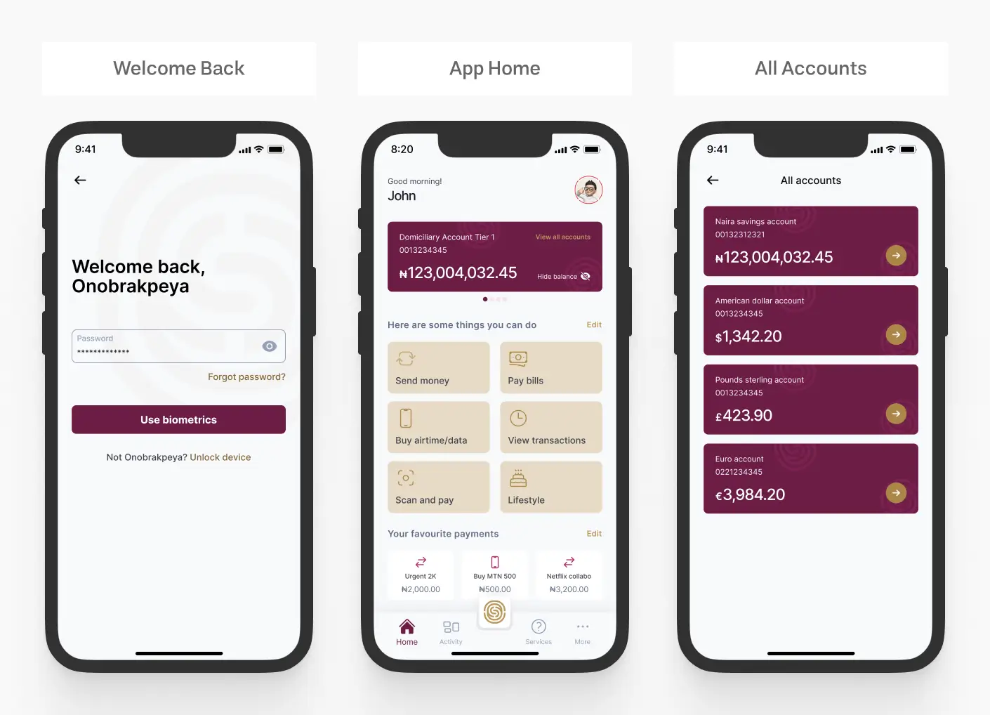
- + Login/Sign Up
- + Banking Account Creation
- + Resetting Password
- + Retrieving Username
- + Transaction PIN Setup
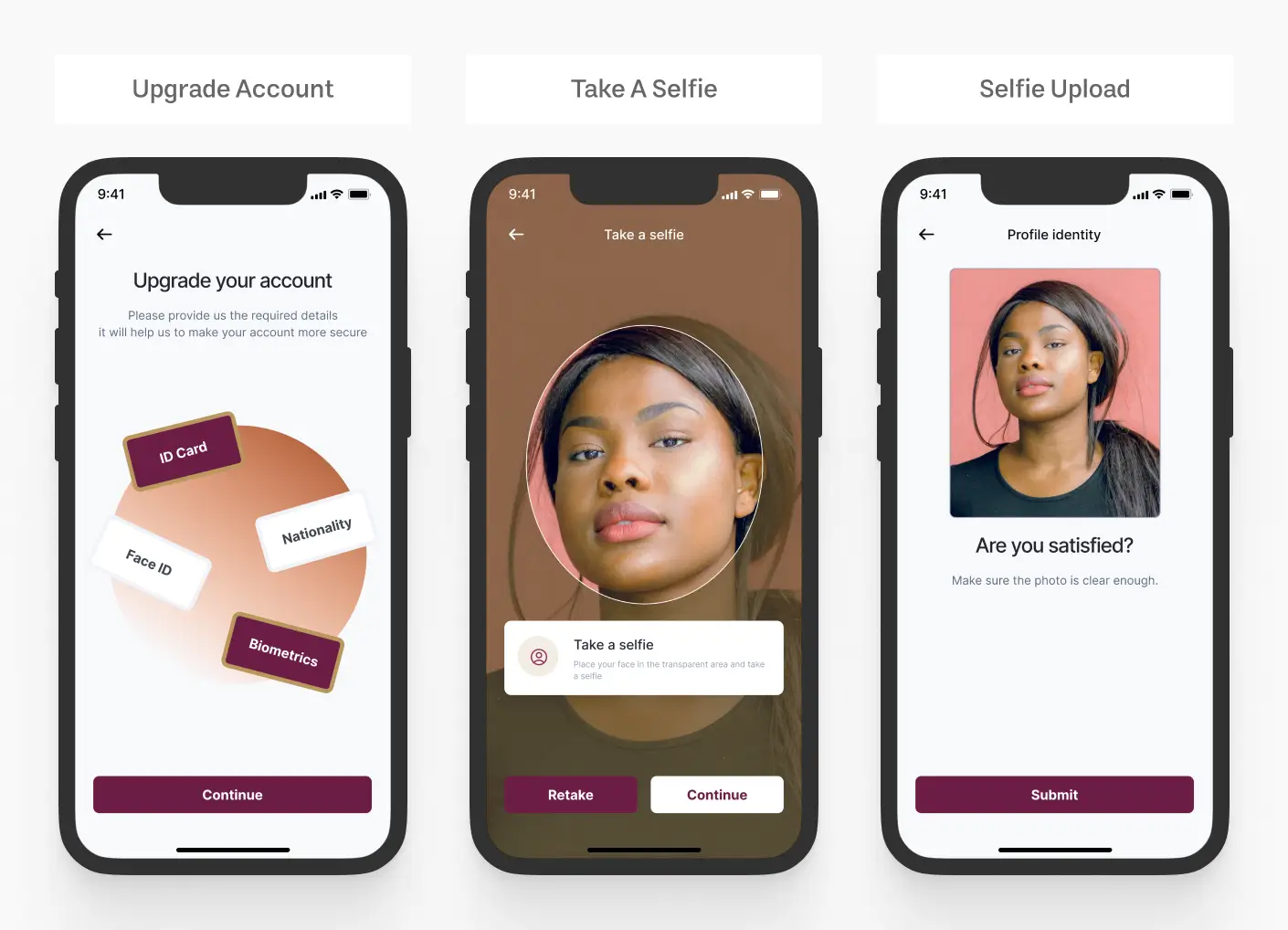
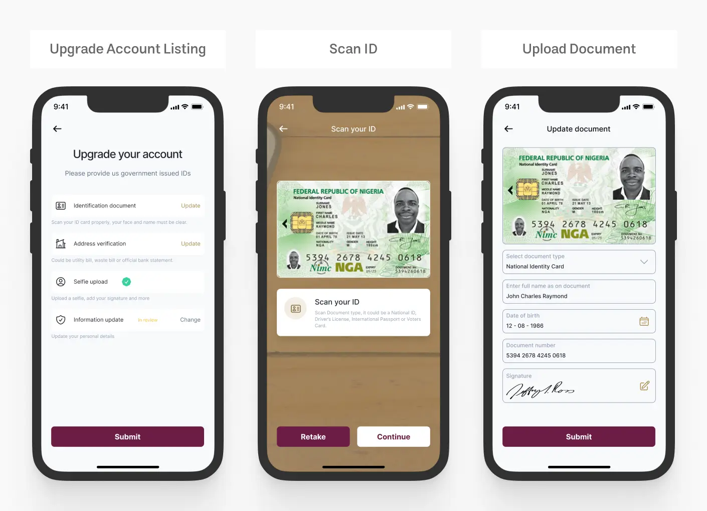
- + Account Upgrade / KYC
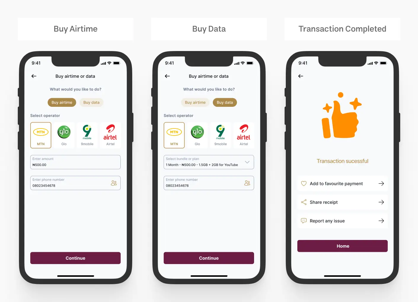
- + Buy Airtime and Data
- + QR Scanning
- + Lifestyle
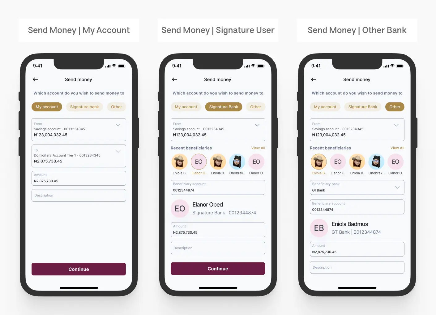
- + Send Money to Other Bank
- + Send Money to Yourself / Inter Bank
- + Send Money to Signature Bank User
- + Beneficiaries management
- + View Accounts
- + Account Balance
- + Transaction History
- + Account Statements
- + Transaction Details/Receipt
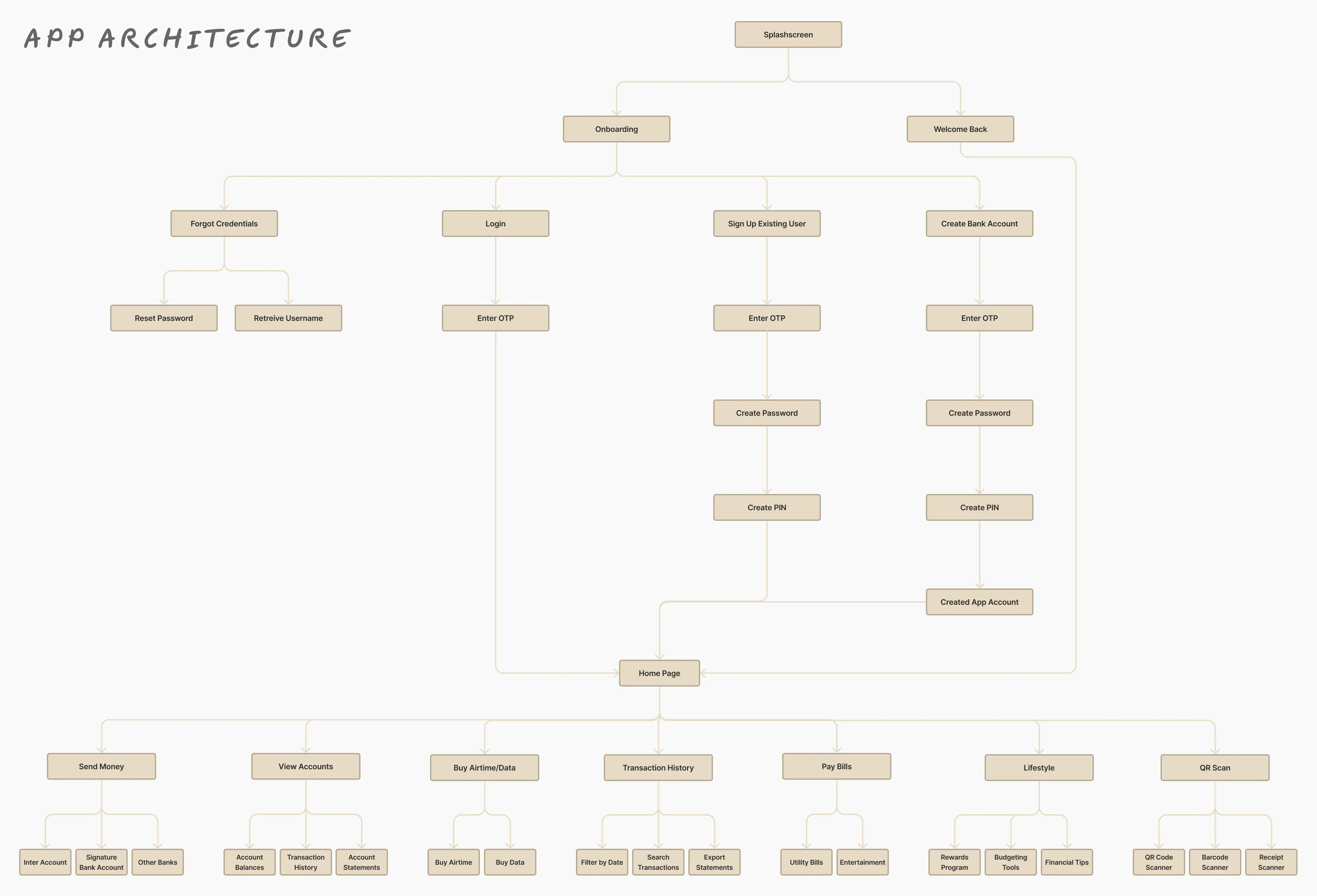
App Architecture
I have developed a comprehensive app architecture for the mobile application, taking into account the product features outlined above as well as insights gathered from the competitive analysis. This detailed architecture aims to ensure the app's optimal functionality, a seamless user experience, and future scalability.
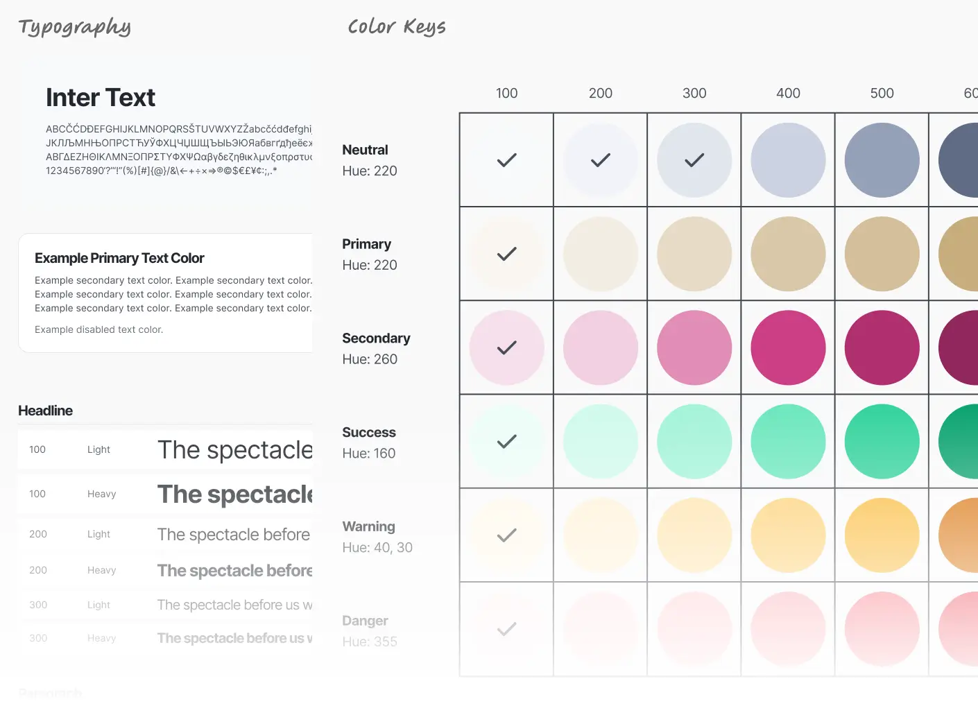
Style Guides
Color Palette & Typography
I chose the Inter font as it is ideal for mobile app design due to its readability, modern and clean aesthetic, and versatility with a wide range of weights and styles. It's optimized for screens, ensuring consistent and clear rendering across devices. The color style was created through careful selection of a harmonious palette that aligns with the brand identity, ensuring visual appeal and consistency throughout the user interface.
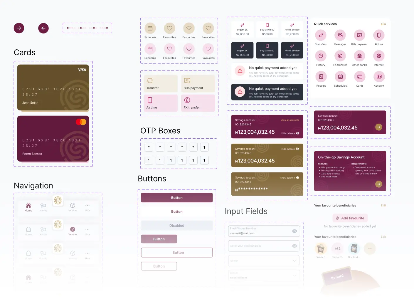
Design Components
Designing became much easier than expected because there were multiple design iterations requested by the client. This allowed me to create various versions of existing components without significantly impacting or slowing the progress of the project.
Final Designs
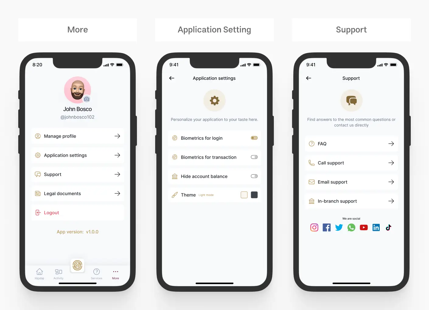
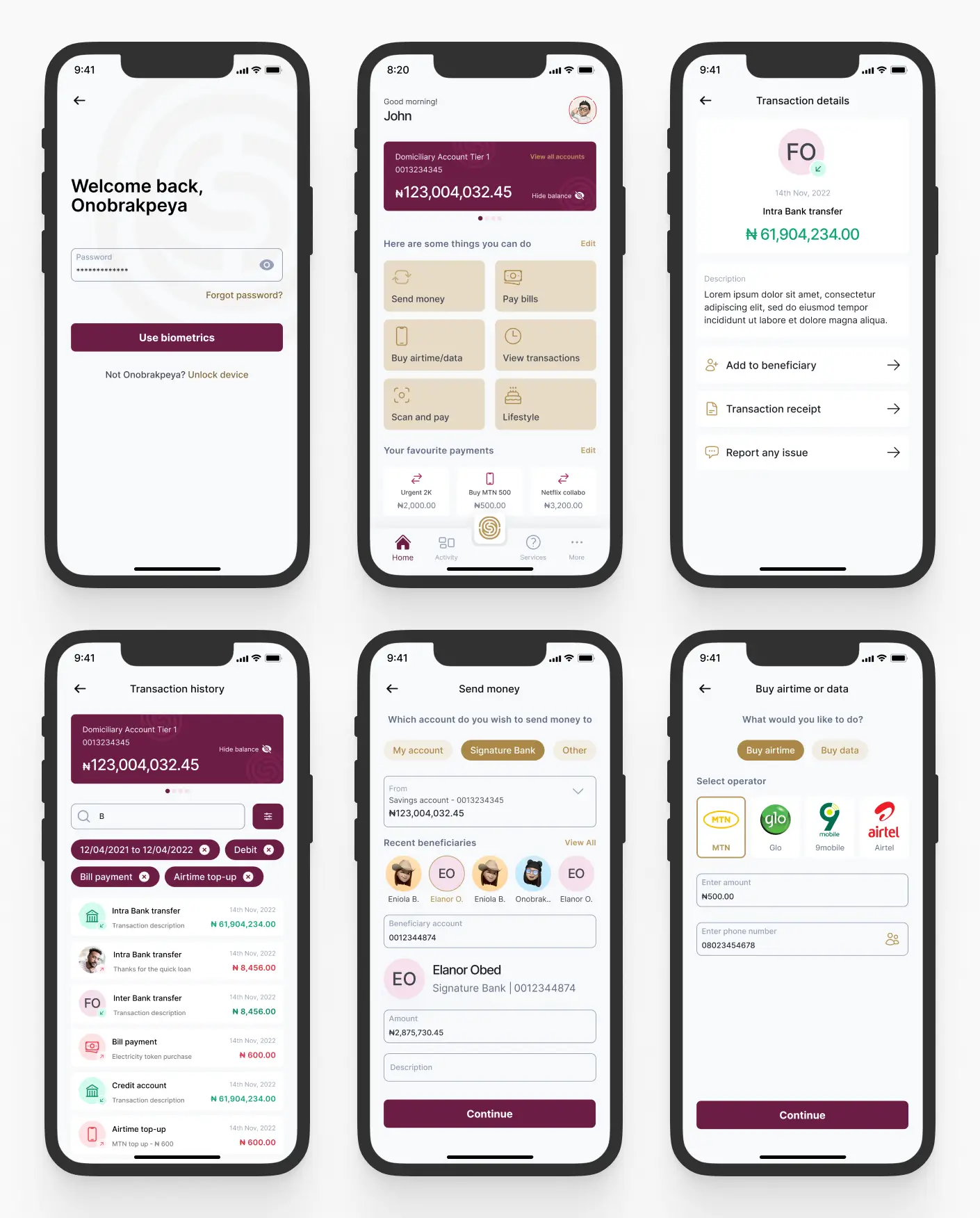
The UI designs done with Figma ensured a clear, user-friendly layout, streamline development, and facilitate stakeholder's feedbacks.
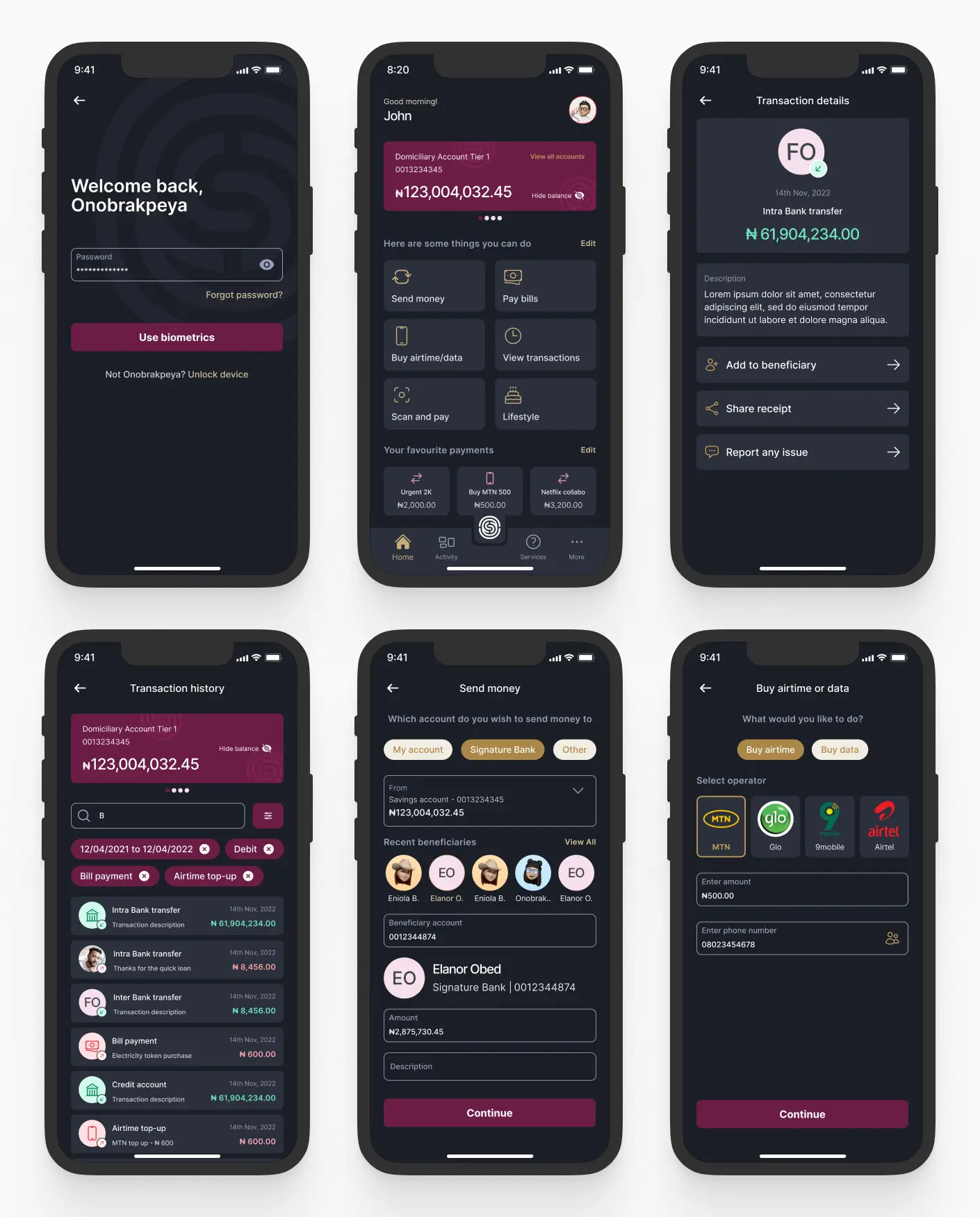
New Feature Introduced (Enter The Dark Side) 🌚
Recognizing the growing trend and aesthetic appeal of dark mode, Elara Solutions requested a dark mode version of the mobile banking designs as part of the handover process. This task was straightforward because I used a component-based design approach for the entire project. This allowed me to easily create new color variations of the existing colors, ensuring a seamless transition to dark mode for the app designs.
Request to view more ......